Packaging Redesign
Industry Research
Marketing Copywriting
Dr Teals
This project reimagines Dr Teal’s packaging to appeal to a younger, spa and sport-oriented audience while maintaining the brand’s core identity. My redesign emphasizes a more calming and sophisticated aesthetic by simplifying typography, standardizing color palettes, and incorporating illustrations in place of photography. This project included market research, competitor analysis, and a design system that refines Dr Teal’s visual language for a modern audience.
Before and After
For the front of the packaging I enhanced clarity by refining information hierarchy, standardizing typography, and incorporating sketched illustrations.
Simplifying this layout reduced visual clutter, ensuring the product benefits stand out with a clean, modern aesthetic. A refined sans-serif typeface for details creates a balanced and cohesive look.
Sketched illustrations replace photography, reinforcing the brand’s natural essence, while custom color schemes align with scent profiles to create a more intuitive experience.
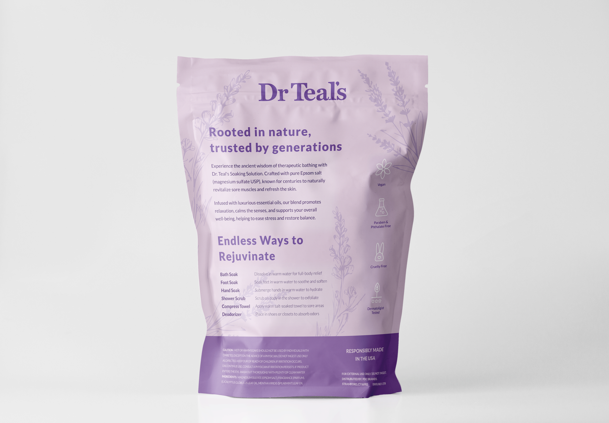
The back of the packaging was completely reworked to align with Dr Teal’s potential to attract spa and wellness-focused consumers. All copy was rewritten to emphasize a more natural, traditional approach rather than technical descriptions, creating a more inviting and holistic brand voice.
The redesign also introduced multiple suggested uses to encourage more frequent product application, driving repeat purchases.
Additionally, key features were made more prominent with custom-designed icons, improving legibility and reinforcing the product’s benefits at a glance.


