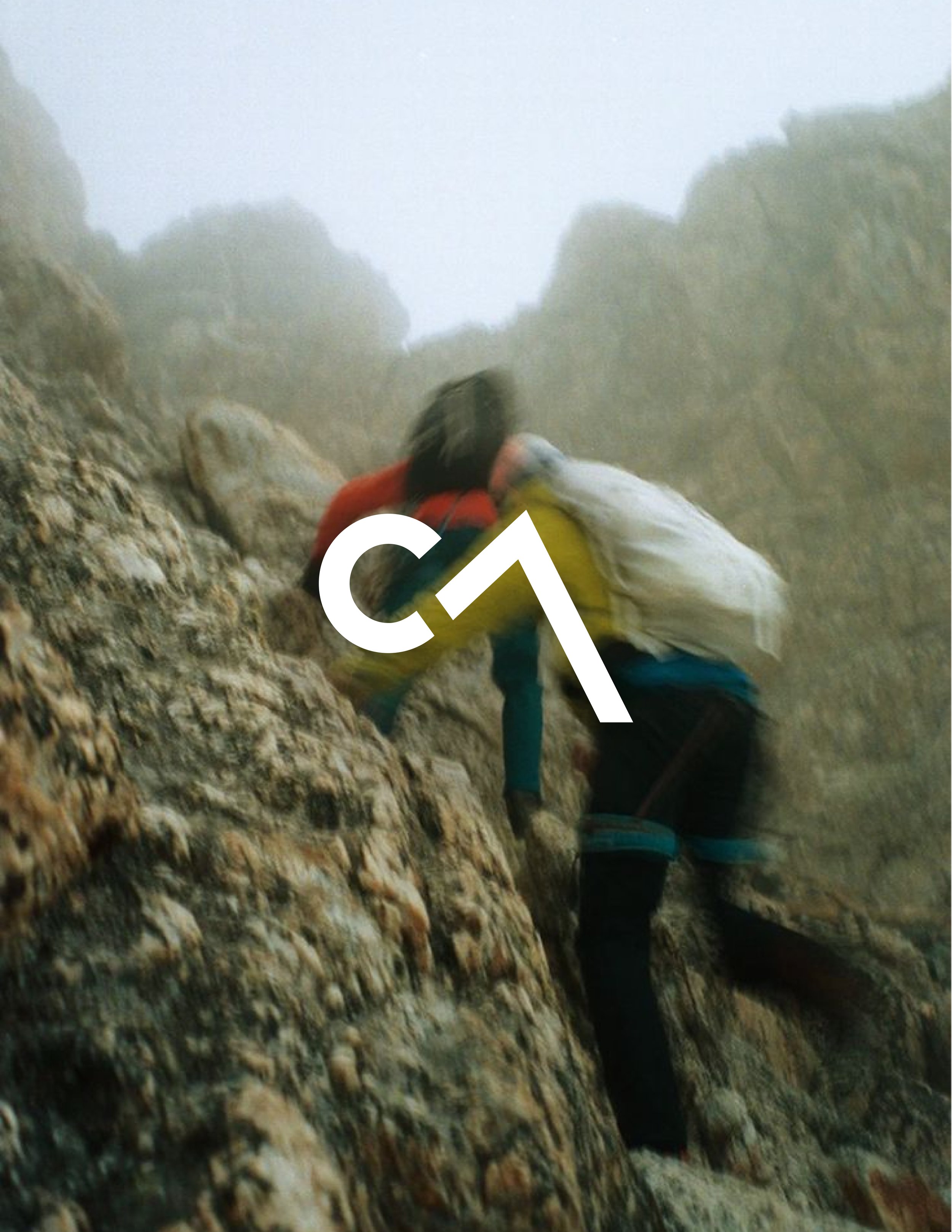
I was challenged to create a brand identity based on a randomly assigned letter and number combination.
Given "C,7" I developed Core 7 – an outdoor lifestyle brand inspired by the spirit of exploration and adventure.
Brand Identity
Business System
Industry Research
Core 7
The red "C" evokes a setting sun, while the gray "7" creates a mountain peak reflecting the rugged granite and slate rock commonly found in alpine landscapes.
I began by sketching, focusing on concepts that integrated the letter "C" and the number "7." My goal was to craft a design that felt both simple and intentional so that I could ensure the forms remained recognizable while embodying a shape with the potential for many interpretations.
My Process
After vectorizing several sketches, I found a design that felt promising. To enhance the legibility and add some structure, I separated the "C" from the "7" while also making the “7” have a flat bottom to imply a horizon. After more sketching and optical adjustments I landed on my final logo.
Next, I analyzed color palettes from competing brands and explored variations in hue and value to find a distinct direction.
I selected Crimson Red and Charcoal Grey to honor the classic expeditionary brands that often featured vivid reds and yellows, while anchoring the design in natural earth tones.


